Overview
Redefining the online experience of Reason
Reason Studios is one of the most acclaimed brands in the music production industry. After 20 years on the market the company sought to modernise their digital presence to match their reputation. The effort aimed to attract a new generation of music makers with a best-in-class web experience.
To comply with my non-disclosure agreement I have excluded confidential information in this case study. The presented information is my own and does not necessarily reflect the views of the client.
Year
2019
Client
Reason Studios is a digital product company that creates applications for music production. Their flagship product Reason is a well-known digital studio for playing virtual instruments, recording, mixing and arranging music into complete songs.
Role & Responsibilities
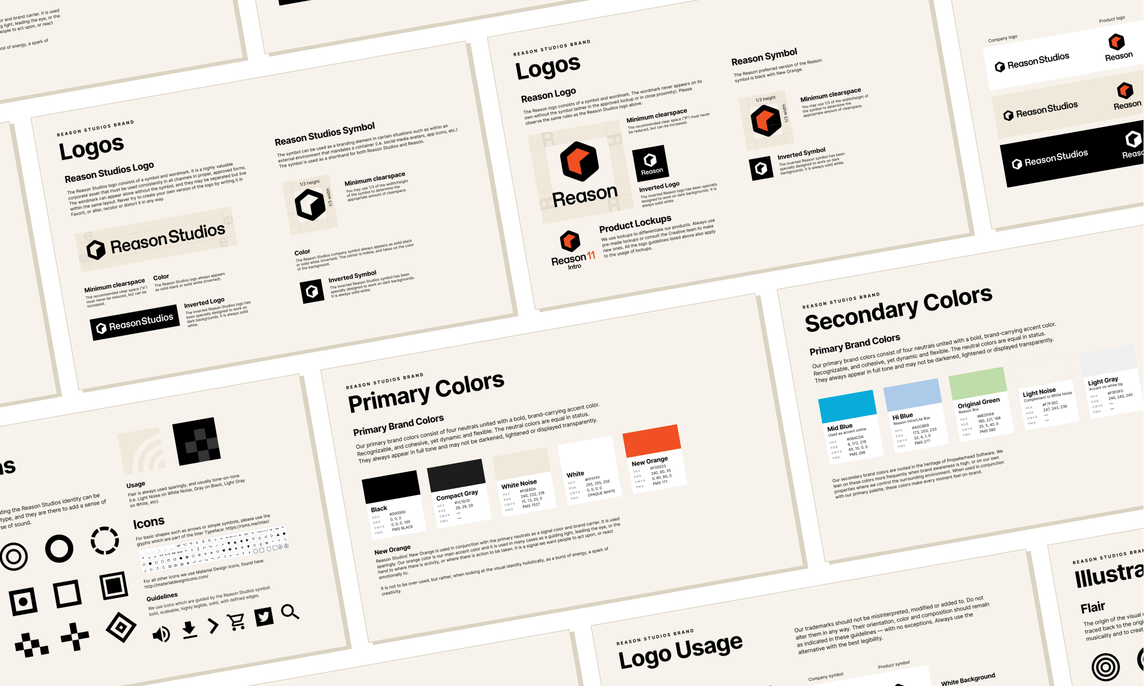
I was in charge of research, prototyping and usability testing. I collaborated with the Art Director to establish the new brand and produce pixel perfect designs of the site.
The Challenge
Redefining the project scope
As Reason Studios product porfolio grew larger and heavier so did their website. The information density on the website had reached a point where users could no longer find the information they were looking for.
The initial ask was to modernise the visual branding and to enable a great mobile-first experience for the ever growing visitors from mobile platforms. However, the website was built on dated technology so we agreed to conduct a complete design overhaul of the entire web experience. The conclusive problem statement became:
“How might we design a mobile-first solution with personalised content and streamlined navigation that decreases general bounce rates and increases the checkout conversion rate?”
Research
Identifying potential areas of improvement
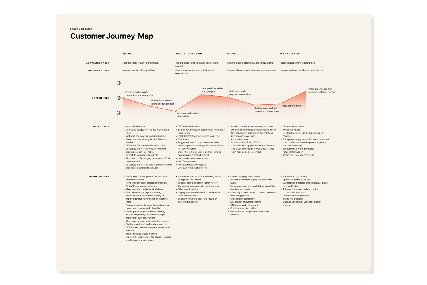
I organized a journey mapping exercise with key stakeholders in order to identify the most pressing pain points on the current website. The workshop gave us insight into the most critical areas in need of improvements and the user stories we needed to address for the redesign.
I used analytical tools and heatmaps to get furhter insight into user behaviour on the site. The data gave me a rough idea of what content and layouts that generated engagement and which areas of the site that had higher bounce rates.
I hosted another exercise with the marketing team with the goal to rank and sort the existing information on the website with the use of a card sorting workshop. The goal was to reduce the amount of navigable pages and streamline the information architecture. Some of the key takeaways became:
01 Streamline findability and searchability
02 Enable in-depth search and filter combination in the web shop
03 Offer a dynamic shop experince through personalised offerings, curated charts and product groups
04 Provide curated and personalised content
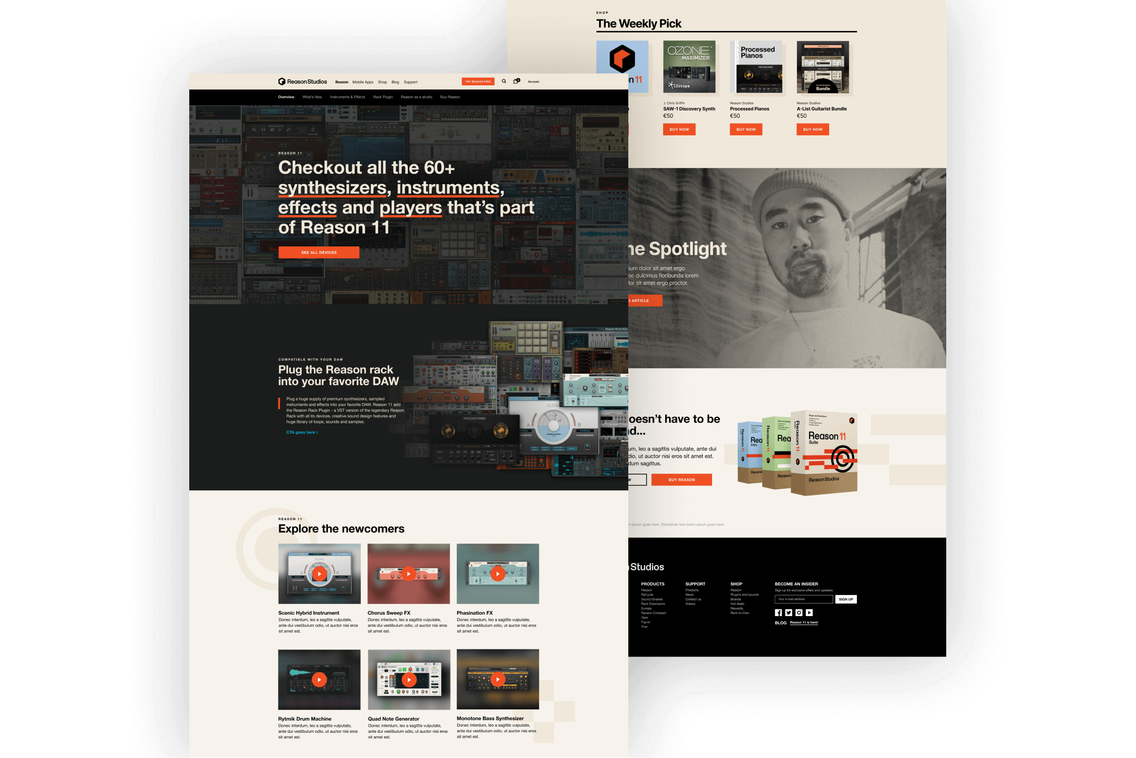
05 Design dedicated landing pages for all product categories to make the site easier to overview and navigate
06 Enable shop browsing, product and subscription management from all platforms
Process
A top down approach to design the site
With the content strategy outlined I mapped out a general idea for the Information Architecture of the site. I decomposed the overarching structure of the site into smaller sub-systems which helped me understand what sections and elements I needed to design for each page. In turn, this allowed me to build a library of reusable components to ensure design consistency and rapid development.
To ensure that the navigational structure and the layouts performed equally well on desktops, tablets and phones alike I used a mobile-first design approach. By starting with the most limiting device I was forced to prioritize content and design solutions ruthlessly which gave me insights into the core experiece early on.
The marketing team and I conducted several usability tests throgought this process to further inform our design decisions. We focused on evaluating the navigational structure and the content to reveal potential pitfalls. This iterative design approach was maintained until the release of the site when more sophisticated analytic tools helped influence the design decisions.

The Outcome
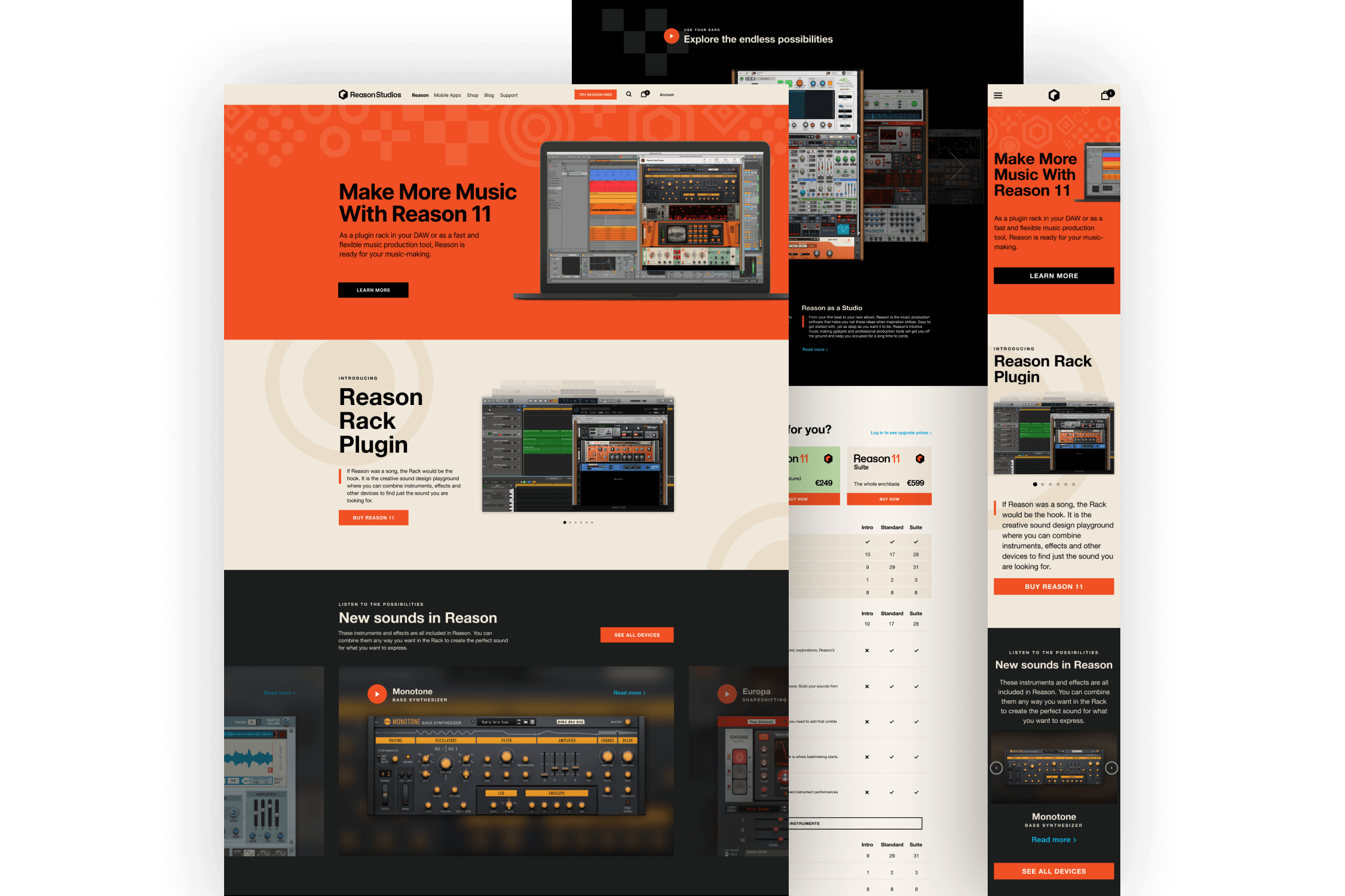
A modernised web experience that raised traffic and sales
A complete digital declutter reduced the number of navigational pages while still maintaining SEO permance and increasing the number of recurring visitors to the site.
The new site offered visitors a more streamlined and user friendly experience that serves them personalised content at the right time.
One year after release I can conclude that the company had the most successful sales year ever.