Overview
Enabling asynchronous collaboration in the recruiting process
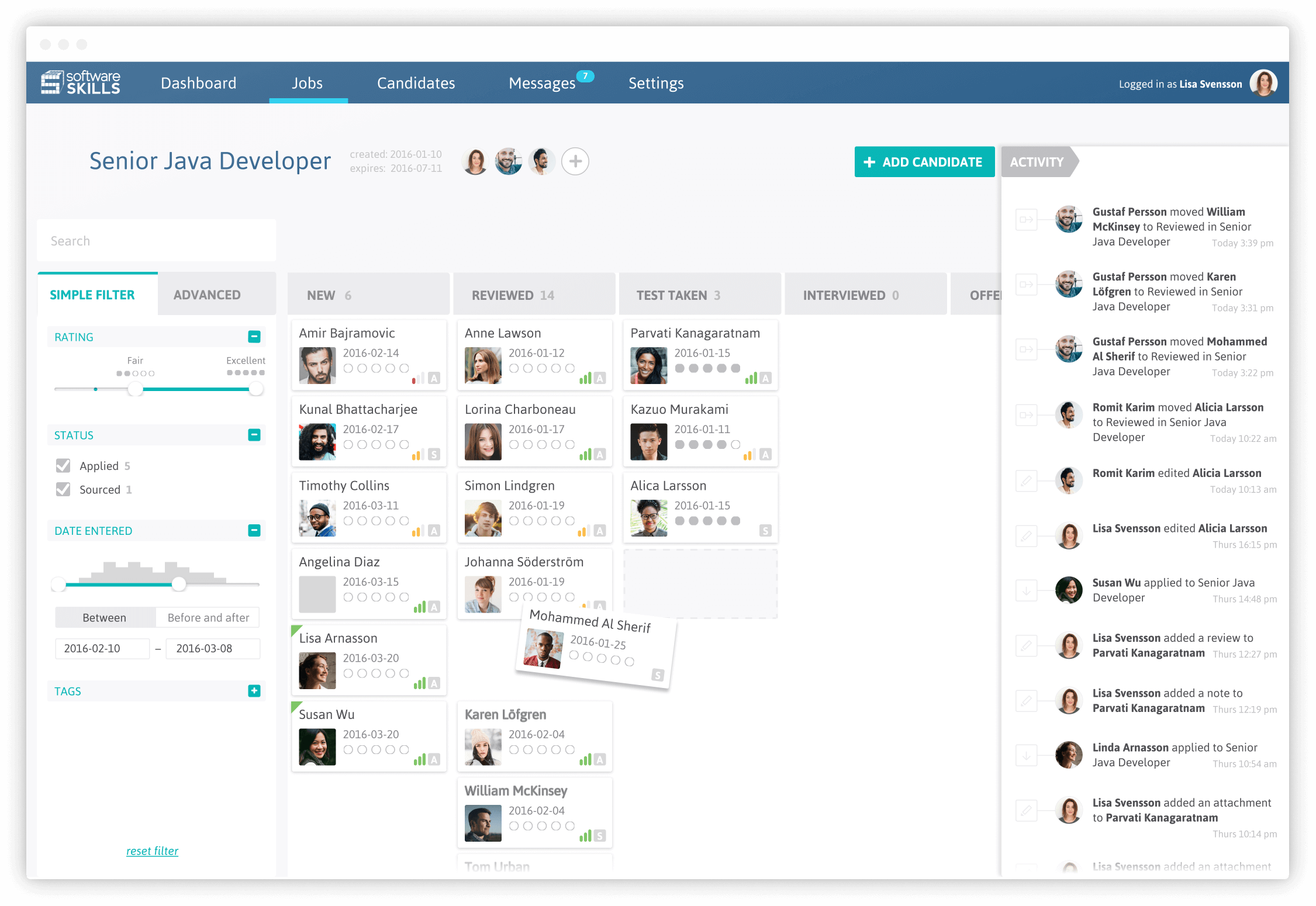
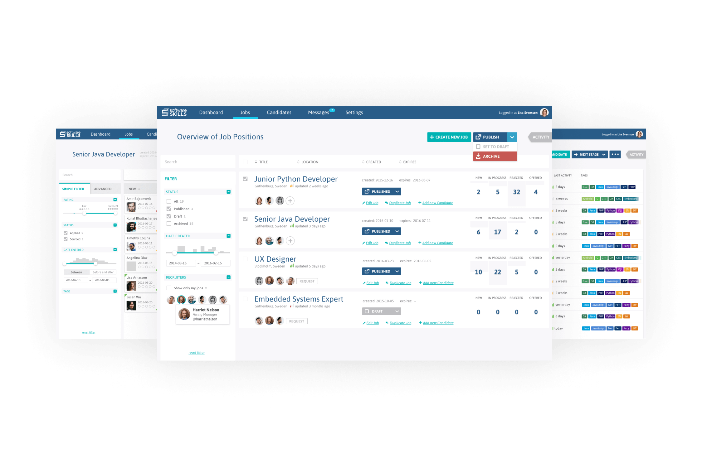
Honeycomb is a so-called Applicant Tracking System for handling everything related to the hiring process. It manages everything from advertising open positions to oversee large number of applicants and their data throughout the recruitment process.
To comply with my non-disclosure agreement I have excluded confidential information in this case study. The presented information is my own and does not necessarily reflect the views of the client.
Year
2015
Client
Software Skills is a recruitment agency within the tech sector. Their competitive edge consists of conducting extensive code tests to weed out the best applicants.
Role & Responsibilities
I worked alongside another UX designer where we were in charge of the complete concept development from early research to prototyping, usability testing and pixel perfect design.

The Challenge
Increase the number of matches
The owner and founder of Software Skills expressed a need for getting more visitors to apply to jobs on their website. An increase in number of potential candidates was believed to result in more matches between companies and applicants.
However, during the research phase we discovered that recruiters had a greater need of navigating and finding candidates among the vast number of current applicants in their present system. This discovery led us to change course to focus on improving the overall matching process rather than filling the system with new applicants. The problem statement changed into:
“How might we design a system that enables asynchonous collaboration, collective decision-making, and efficient searchability among existing applicants to get more matches between applicants and companies?”

Process
Close stakeholder collaboration informed the application architecture
The foundation of the concept was established by conducting open-ended interviews with recruiters at Software Skills. A contextual inquiry was held to get in-depth understanding of their day-to-day routines and work practises.
A Benchmark Analysis was conducted to get an understanding of what design patterns other applications used to solve use cases similar to needs expressed in the interviews.
To get insight into what information and fuctionalities recruiters needed in different stages of the recruitement process we ran an Affinity Clustering excercise together. The result was summarised and translated into needs which we mapped in an Awareness Mindmap. The mindmap was used to ideate around design patterns for asynchronous collaboration and efficient decision making.
We took a top-down approach to settle on the overall structure of the application. By mapping features into groups we landed in a general Information Architecture of the application. This was in turn decomposed into smaller sub-systems which allowed us to focus on the detailed interactions of each screen.
The prototypes were used for Usability Tests which we conducted iteratively throughout the whole design process. Users where typically given scenarios with tasks to complete while 'thinking aloud'.
Lastly, we developed a set of Style Tiles to guide the tonality, and aesthetics of the application. These were used to guide the look and feel when implementing the final pixel perfect designs.

The Solution
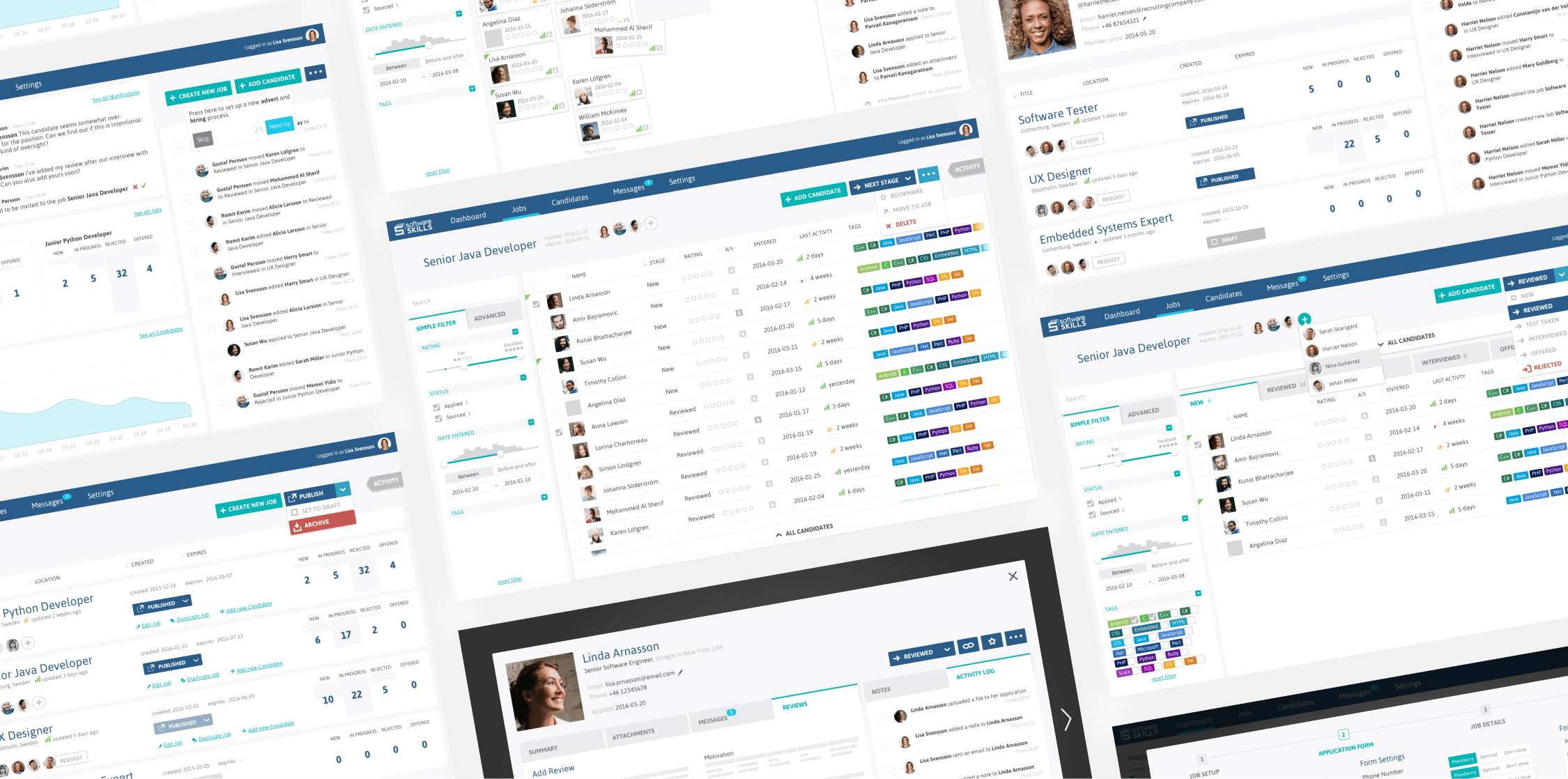
A comprehensive application that covers everything related to the recruitment process.
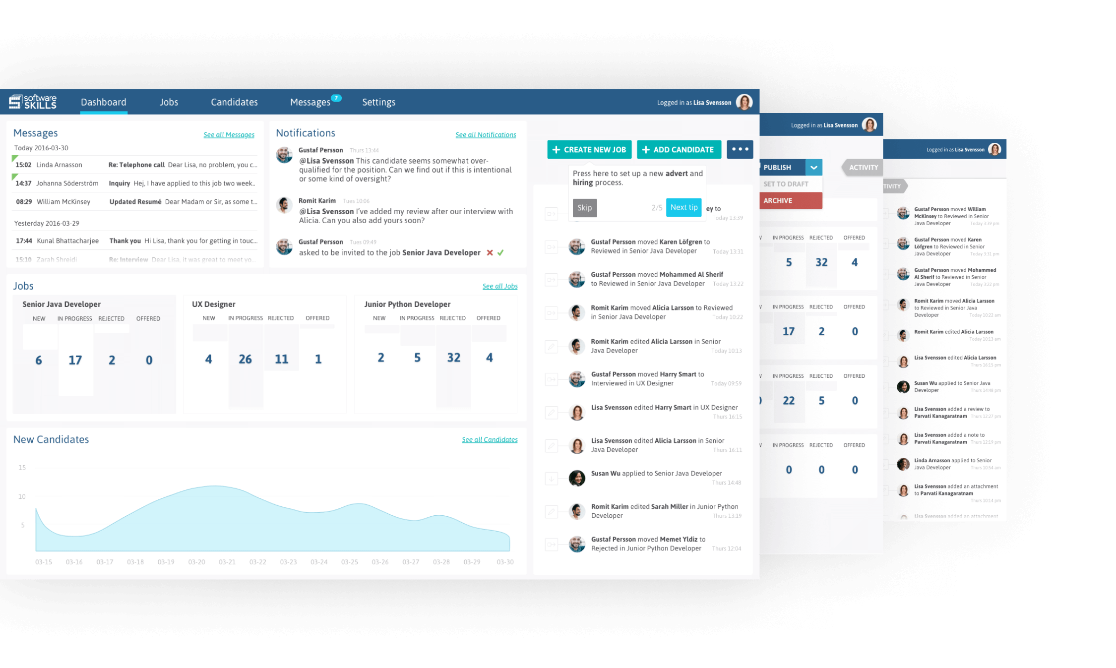
The design resulted in a system which improved collaboration and transparency between the members of the recruitment team. We designed a wide range range of features to allow efficient asynchronous collaboration like dashboards, real-time chat systems, contextual actvity logs, shared annotations, voting systems, activity indicators etc.
The application proved so successful for the recruitment team at Software Skills that the owner turned it into a white-label product that he then sold to competitive businesses.

